When designing the visual aspect to a website or creating images in general the dilemma of choosing proportions inevitably comes up. By choosing proportions I mean the idea of designing a space to hold the informational content of a website or visual information of an image. Occasionally these decisions are made simpler when making the proportions of information container boxes (which I will refer to as a “div” from now on) just big enough to contain the information. For example, often on websites that have long blocks of text, the div that contains that text generally is not given specific proportions and so the ratio it ends up having is just the width of the browser screen and the height of the number of lines of text. This is an example of a default proportion because no specific proportion was given to the div box and so it simply expanded just enough to contain the text inside. This can also be though of as typing text into a word editor and deciding the proportions of the text are the window width by the number of lines. This often is not visually ideal because screen widths of browser windows change and so a designer that has a well thought out layout for the information of a website generally gives div boxes specific sizes using CSS (“Cascading Style Sheets”, CSS controls most of the visual aspects of a website).
There are a number of “tricks” a designer may have in mind when presenting the content of information to a website. One of the most important ideas would probably be uniformity. Websites that lack rules of where to place information are often difficult to navigate and generally messy visually. Symmetry also can play an important role in designing a website and can be easily achieved using CSS by centering the website’s information and planning the sizes of divs. The last idea I would like to mention is the proportions of the divs which will be how the information of a website is presented. I would also like to point out to any readers who are not familiar with making a website that divs often are information containers to other div boxes that also contain their own information.
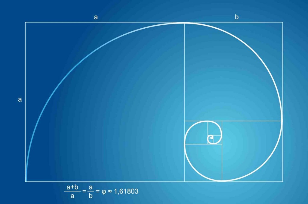
Certain proportions are considered to be visually pleasing and one of the most famous examples is the golden ratio. This ratio has been used by many artistic disciplines and has been observed in many natural “designs” (some examples may be spirals of seashells, branching structure of trees, roughly the proportions of limbs of people, ect. See image below).

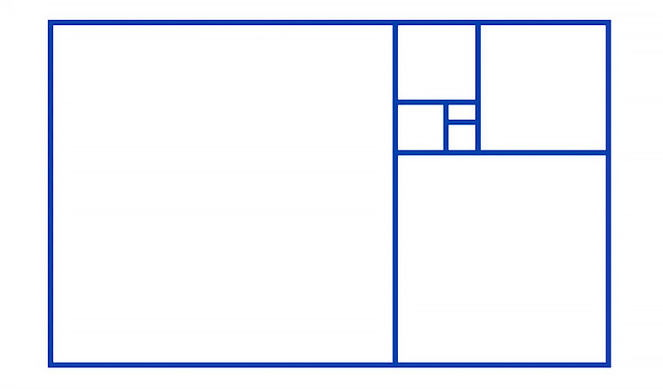
The ratio itself is an irrational number but is often simplified to 1.618 for use (The exact value is the square root of 5 plus 1 divided by 2). The significance of this number is that if it is used as the length of a rectangle where the height is equal to 1 then the finding the square that is 1 by 1 inside the rectangle leaves leftover area inside the rectangle. That leftover area has the same proportions as the original large rectangle (see image below).

What this means is that the ratio is unchanged by expansion or contraction. This property is useful when designing on a computer because the size of the information is abstract. The informational content of a website can be shown at any size and it would still make sense because it is not grounded in the physical world. Placing information inside of a div box that has the golden proportions then would allow for a presentation of information that follows classical ideas of visual beauty. In addition because the golden rectangle can be divided into squares to find new smaller golden rectangles, information can be imbedded as divs with these proportions one inside another. Information of importance would be placed inside the largest rectangle with sub category information in the contracting rectangles. The result would be a visually pleasing layout spatially with information organized conceptually by relative size.
Here is an example of how to set up div boxes following these proportions: Text box example
Other Resources:
More Information on the Golden Ratio: Golden Ratio
Article Written by: Alex Simes


