The time has finally arrived!
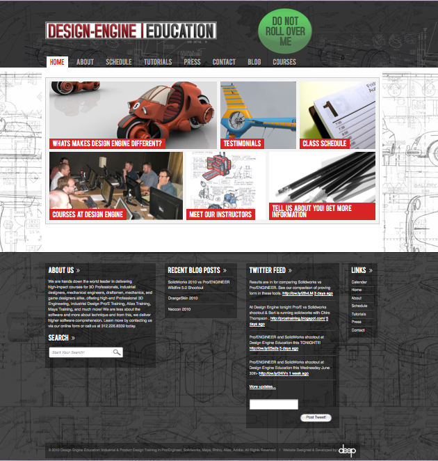
After a looooong 10 years, Design Engine’s Training School Website has got a new face! At Design Engine, we’re all about being design forward. And with that said, our site should represent just that. We are always keeping up with the latest industrial/product design & engineering industry news and learning innovative, advanced design techniques. Therefore, we want to convey who we are and the pride in what we do. After all, first impressions are crucial. We only have a few seconds to capture our visitors/audience – what will make them choose Design Engine Education over another design school? Not only is our new look important to our business but so is the content you’ll find on our site. We want to give our potential clients informative and helpful information so they can make a sound decision on where to train. Visitors should be able to navigate through the site with ease.
Personally, I LIVE for projects like this – renovating sites from night to day. I mean, yeah, there are countless times when I wanted to throw my precious Mac because I couldn’t get a module/code/component/widget/php file to work. But in the end, when it all comes together, there’s no greater satisfaction and no greater pride in my work. It’s my art. It’s a good time. It’s my calling. It’s all about the image and interactivity.
The designers and developers at Deep Interactive have been working around the clock for the last 3 weeks to make sure our site is bug free and working over-and-beyond expectations. Our TWO main goals for the site were simply this: 1) to make the site as user-friendly as possible and 2) to create a badass design!
For example, our renderings and design work are elite in this industry, and our old site wasn’t doing them any justice. We wanted to highlight them with the most up-to-date, interactive technology. We really wanted them to pop-out at our site visitors while the rest of the site behind the images darkened, so that the focus is all on our work. We want our work to come to life!
Another user-oriented element we added to our new site is giving visitors the option of seeing a LIST of upcoming classes as well as a schedule-layout. We did this because each person has a different visual preference.
We’ve worked extremely hard to create a website that we think will give our visitors the ultimate experience. There’s no greater feeling than when past clients, students, and others tell me how amazing the site looks (especially in comparison to our old site). I know that I’ve done my job when the “oohs” and “aahs” come out.
I hope that you enjoy the new site as much as I enjoyed working on it. If you have ANY feedback/comments, please don’t hesitate to tell us what you think! The life of a website is ALWAYS changing, as it is a work-in-progress. There’s always ways to improve the user experience. After all, This website is for YOU – our visitors, students, clients, partners, and prospects. Email Justina at justina@designengine.com.
Article Written by: Justina Nguyen


