
George R.R. Martin paints pictures with words, but what happens when a Nike designer translates these words into actual pictures? Wonderfulness.
If you’re Nike Brand Design rock star Darrin Crescenzi, and you’ve created everything from the Nike Fuel gauge to the U.S. Men’s Olympic Basketball uniforms, what do you do in your spare time?
You, like the rest of us, get hopelessly addicted to George R.R. Martin’s fantasy series Game of Thrones. (Warning: Extreme, esoteric geeking out ahead. If you have no idea what the heck Game of Thrones is, go read the series, then meet me back here in a few months.)
Like many people, I was introduced by the HBO adaptation–I’m sure to the chagrin of the longtime readers. I began reading the first novel while watching the first season, quickly becoming hopelessly obsessed. I basically disappeared for about five months, devouring all five books in the series, culminating in this borderline-depression when there were no more books to read,” Crescenzi tells Co.Design. “I’m not entirely sure of the full impact the books had on my social life, but there was definitely a span there where friends stopped calling.”
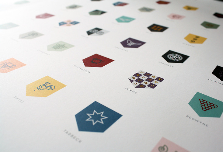
But unlike the rest of us, Crescenzi didn’t end his obsession there. He’s a branding expert, after all. Logo and typographical designs are what we eats, sleeps, and breathes. So while he devoured the books, he also kept a notebook at his side, recording the text descriptions whenever George R.R. Martin introduced a new house sigil. By the third book, Crescenzi stopped taking dictation and began drawing the sigils then and there, eventually compiling the whopping collection of sigils you see here. “I didn’t brand each house–George R.R. Martin did, and whether or not it was intentional, the result is an integral piece in the success the series,” Crescenzi says. “All I wanted to do was give them a sort of unexpected and unified visual language.
“The sigils really do act as branding, in that they give each character formal distinctions–Lannister’s use of crimson and gold, for example, sets that family apart from the rest on a purely visual level. But they also serve to give a vague indication of the values and psychology of the wearer. That same crimson and gold alludes to power and wealth and vitality, and when combined with the symbol of a rearing lion, tells a holistic story about the prominence of that family and their importance within the narrative,” he explains. “Conversely, the white and grey of House Stark is a straightforward representation of them–stoic, bleak, rather depressing. House Bolton’s pink and red ‘flayed man’ sigil pretty much screams psychopath.
“What I find most fascinating, however, is the fact that these ‘brands’ exist only as the written word. A Song of Ice and Fire is devoid of illustrations (other than the maps, of course), and yet when we read a description of, say, a battle between Lannister forces and Stark forces, we immediately create a mental image of screaming gray-clad men rushing into an army of red, despite not being part of the exact verbal description of a battle. These brands become such a key part of the reading experience–Night’s Watch black might as well be Tiffany blue or UPS brown or T-Mobile pink.”
I asked Crescenzi if his work at Nike influenced his work on this sort of visual fan fiction, and surprisingly enough–while most designers tend to distance their professional projects with their geek side projects–he admitted that it absolutely did. “One of our biggest challenges is maintaining a consistent brand voice despite having an incredibly diverse consumer-base. Athletes have very different interests, and sometimes you want basketball to look like basketball, women’s to look like women’s, running to look like running. Other times, you just want it all to look like Nike,” he explains. “Then, you try to maintain brand voice though both Nike and in-direct retail, digital, out-of-home, broadcast, and social media, and do it in incredibly diverse marketplaces around the globe. It’s a daunting task and takes teams of talented and highly organized minds to make it happen. This immense scope of our work makes discipline a core competency for designers here. “That endless pursuit of visual consistency was one of the driving forces behind the look and feel of the poster. I never thought of the project as a series of logos; The approach was much more that of creating an icon set.”
In the end, as true as he remained to the books, Crecenzi did take a few artistic liberties of his own. He ditched all of Martin’s descriptions of physical figures, as he didn’t feel the forms would shrink well to icon-size prints. (He also just found such depictions, like House Umber’s giant breaking out of chains, too literal for his taste.) Other times, he combined a few of Martin’s visuals into one simpler, unique logo.
“House Seaworth, one of the most popular within the texts, is a black ship with an onion on its sail,” he explains. “I decided to create a form that was both simultaneously an onion and a ship–in my opinion, the result is more memorable and was more fun for me to design.”
Now fellow geeks, Crescenzi openly admits that a few houses are missing from his poster, but if you’re a diehard GoT fan, who’d like a print for your wall, they’re available for $35.
Click To View Images:


Article Written by: Mark Wilson