NeoCon Interior Design Showcase
Neocon is an annual furniture design showcase held at the Merchandise Mart in Downtown Chicago. This year, Design Engine went to cover the 50th installment of the most important event of the year for the commercial furniture design industry. The world’s leading furniture designers come to showcase their incredibly talented work at this event and this was our take on the expo.
Here are our thoughts and experiences.
Eli’s Experience –
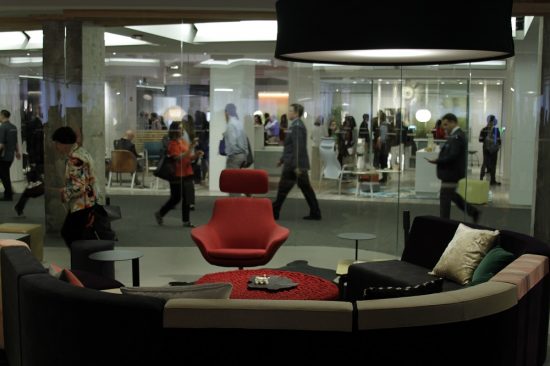
As soon as I walked into the showroom floor of Neocon my senses were overwhelmed. There was people and chatter, and of course, furniture everywhere. There was a wide array of colors and styles. Once I started to focus on each individual scene (set up) my mind settled and I could begin to understand themes and feelings the designers were trying to convey.
Seems like start ups aren’t the only ones building a more casual office environment. It seems that many large well established companies are taking a more creative, laid back and collaborative approach to furnishing their office. Since Americans are spending large amounts of time, the office is becoming a more comfortable place where serious work is to be done, but it has also become a comfortable place to stay in and hang out during break as well.
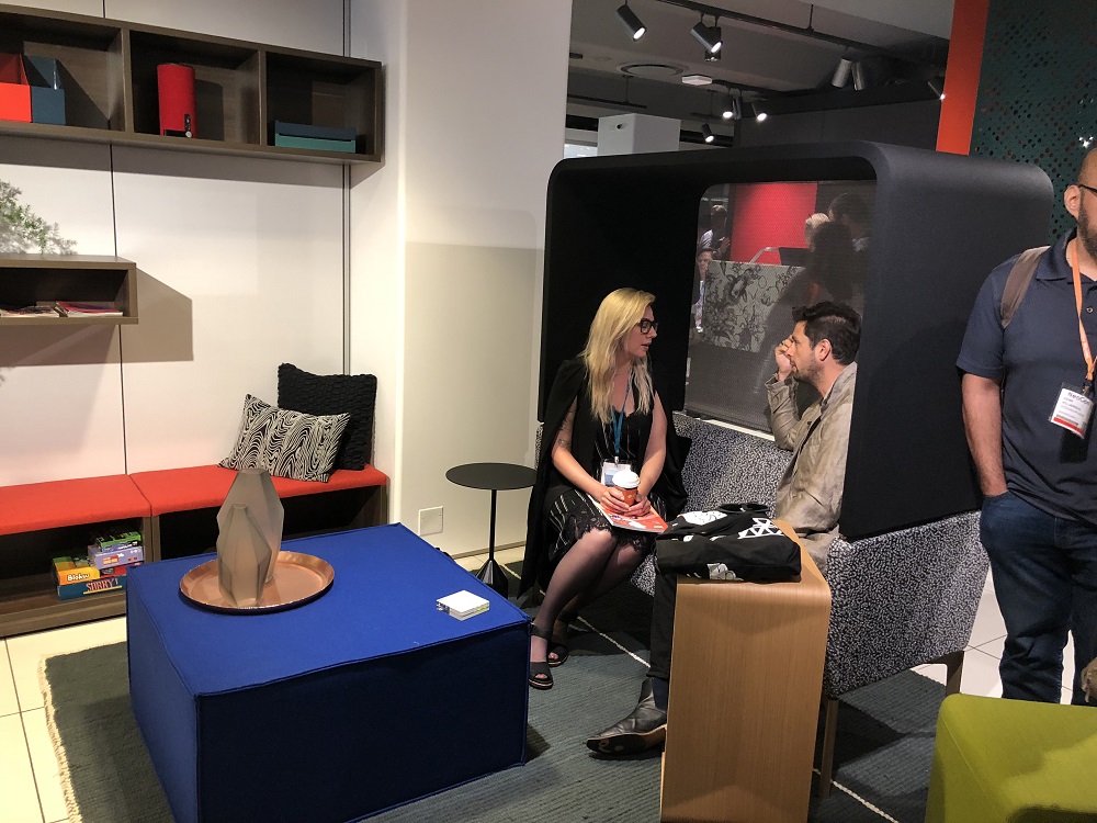
A theme I noticed through was seating areas with large back portions, creating a partial wall or separating yourself, but not completely.
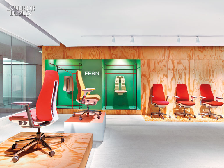
I first sat on a red chair made by Haworth. At first glance nothing about it really screams for attention, the red color does set it apart, however the shape and overall design is conservative besides the color. The chair is tasteful. the best part is the functionality. the back portion has great shape, giving you proper posture and the exact amount of give/rebound on the back. This is something we could easily see ourselves sitting on 8 hours day while using CAD.
Of course, not everything could be a hit. There was small adjustable table just big enough to fit a tablet. Though the ability collapses a fit under a couch provides wonderful convenience, however, it’s unbelievable how something so small could weigh so much. If you didn’t have time to hit the gym you can just do curls with your collapsible tray and be swole in no time.
Steelcase: had exceptional displays. We sat down on table to eat a quick snack a grab a drink. The table and chairs had clean lines and were a very minimalistic but highly functional design. Though the chairs are made from hard material and do not look obviously luxurious or premium, when you sit on them you know it is a well thought out and tested product. The chairs back have perfect flex, and are wonderful option for a lunch or break area.
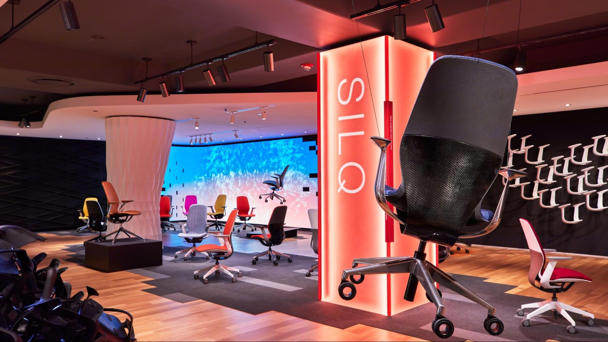
Another notable mention from steel case was a beautifully designed chair, that immediately caught my eye when I noticed the glimmering carbon fiber weave from a distance. Its obvious that SteelCase has some truly talented surfacing guru’s working for them. The profile and implementation of exposed clear coated carbon fiber created a beautiful surface to look at.
Liz’s Experience –
Like Eli, I also noticed the overall theme of the expo was open, casual work spaces separated by partial walls that extend from the furniture itself. Like the anti-cubicle cubicle. This setting is fun and inviting. I really dug this window seating by Steelcase which conveys the overall theme quite nicelessly.
The Haworth and Steelcase exhibits were where I spent most of my time. Both companies have an incredible grasp of taking classic, minimalistic design and bringing it into a modern era. I found the deconstructed furniture display in the Steelcase section fascinating. It really broke up what you were seeing and made you appreciate the approach these designers take when creating what isn’t just functional, well made furniture, but truly art.
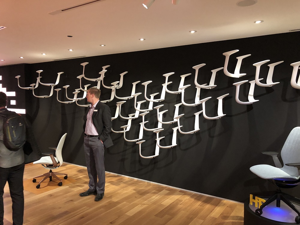
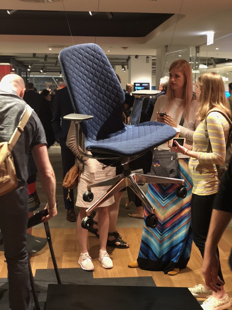
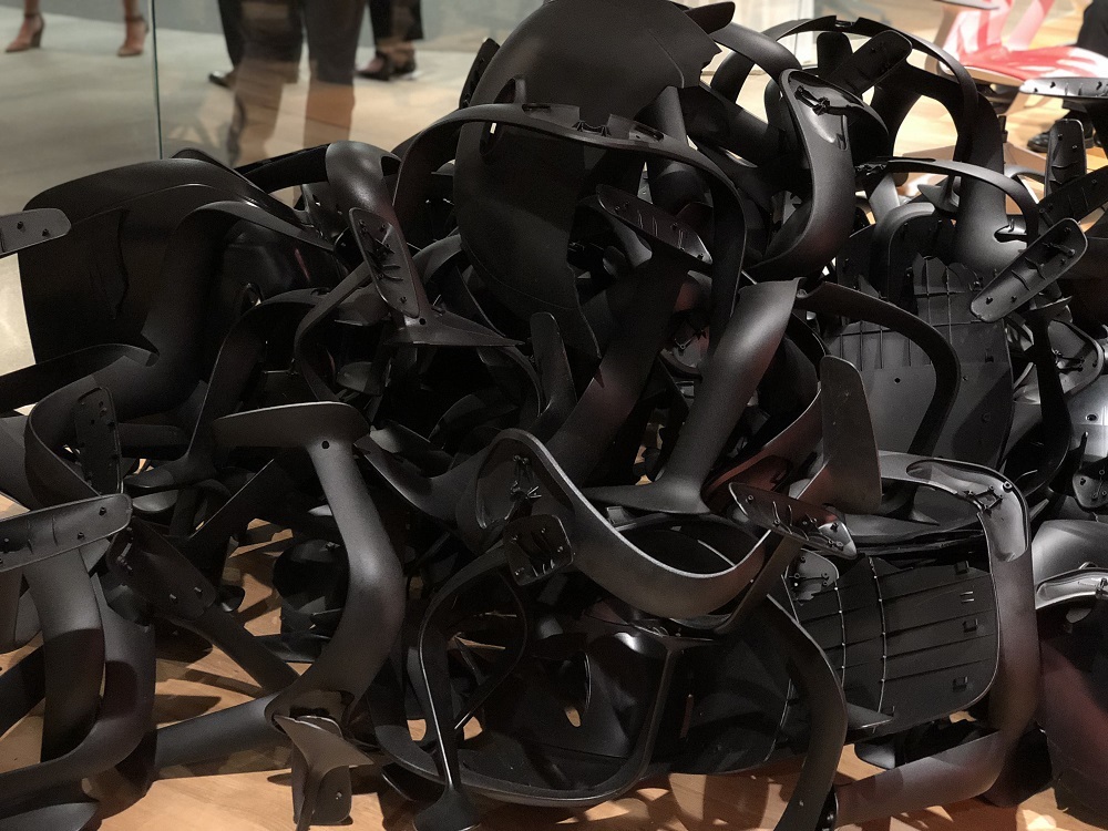
I felt as moving through the Steelcase exhibit there was a sense of moving through the decades which I also appreciated and thought was super neat. They did a great job of encompassing different eras and putting them in chronological order that would be hard to miss if someone wasn’t paying close enough attention.
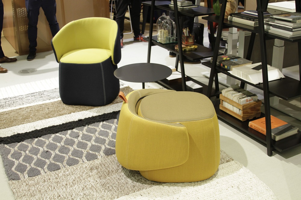
Haworth displayed office and lounge furniture that really popped with vivid color palettes, interesting curves, textures and angles. I found quite a few things from Haworth that I wouldn’t mind taking home for myself like the Openest Chick Pouf chair that turns into an ottoman designed by Patricia Urquiola. It’s beautiful, comfortable and completely customizable to many different color schemes.
After lunch and a quick break in the Press area, I found the Dauphin section at the expo. While I must say this isn’t my usual preferred aesthetic, the colors and textures were quite beautiful. They were also offering glasses of Champagne and hors d’oeuvre which is probably the quickest way to win me over. Needless to say I spent the remainder of my time in and around this area.
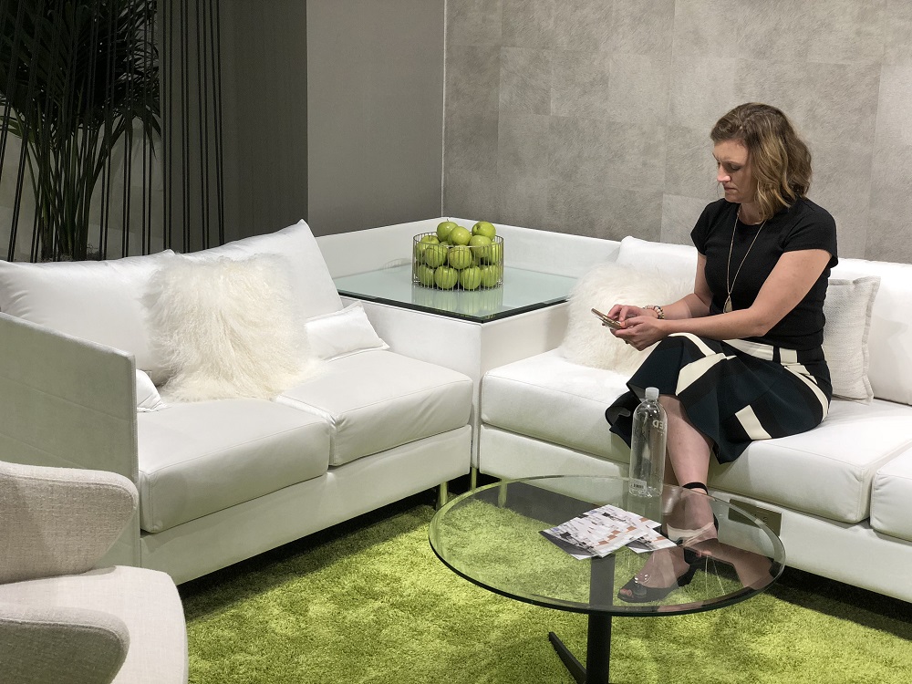
Overall, we greatly enjoyed our time at NeoCon and we were inspired by the beautiful designs. We are happy to see the brilliant work and success of all the companies that displayed, and especially our clients who have sent some of their industrial designers throughout the years to us for training. We are excited to see what the upcoming trends will be and can’t wait to attend next year.
