Design-Engine has a new logo in an effort to bring all the Design-Engine sites together. As we continue to grow, it becomes more and more important that Design-Engine markets itself appropriately. The thinking behind the design of our new logo was that we wanted it to be versatile to all the different industries that Design-Engine is involved in. First there is the Design-Engine Jobs Board and forum, jobs.designengine.com, which provides engineers and industrial designers with job opportunities. Then there is the Design-Engine Publication blog, design-engine.com, which helps us stay in touch with the design community. Lastly there is the school itself, Design-Engine|Education, proetools.com, which provides engineers and industrial designers with innovative training methods in design software. As you check out the sites, notice the new logo on each of those pages.
The most important aspect in the design of our new logo was that we wanted to be able to make stickers or decals that could easily be placed on any surface. We specifically wanted the logo to work with future AMA motorcycle advertising and the logo we used for the past 15 years was long and skinny. We wanted the new logo to be more of a square-shaped logo that would take up space evenly so that decals could be placed neatly.
One of the cool things about working at Design-Engine is how much everyone learns. There is a continuous bouncing back of ideas and approaches and one can’t help but learn. From Social marketing to brain storming to vinyl wraps, everything in an engineer or designers life is about learning, and we find ourselves constantly feeding our brains. Whether it’s swimming at a better pace, steady controlled moves in yoga, or smoother/faster lines on the race track, it’s always about how fast one can reason through problems and ultimately how fast one can learn. That is what we are all about at Design-Engine (as we teach designers how to learn new software).
In our most recent project, we set out to learn how to design and apply vinyl graphics. Our hope here is to master the art so that next fall we can administer a course utilizing all we have learned including Adobe Illustrator, design iteration process, and vinyl wrap combination. Now back to the new logo…
To kick off the new logo we showed it off on the Design-Engine Suzuki GSXR 600 race bike which is competing in the Champion Cup Series CCS expert series for 2012. You can find the bike competing in the 600 Middleweight, Supersport, GTU, Heavyweight, Superbike, and GP Midwest Expert races.
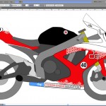
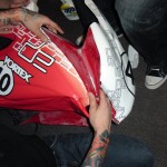 We started the vinyl wrap project by looking at past and current race bikes; our thought being that a little internet “see whats out there” research never hurt anyone. We wanted to do something unique yet utilize a design that would leverage the illustrator/vinyl strengths. In our research we noticed people were doing all sorts of different tribal looks with vinyl applications like Huntly Nash’s #75 race bike graphics from last year and the Michael Jordan Race Team bikes that have been wrapped over the years. Even the AMA Safety First Police Race bikes of 2005 – 2008 were quite loud and busy. We wanted to explore the use of vinyl graphics without getting too much graphically. With the help of Max Trujillo, our graphic design intern, we were able to create our own unique look.
The Vinyl we used is a 3mil cast vinyl and it is stretchy stuff. We used a Kawasaki heat gun to heat up the more compound areas and were especially careful not to stretch or distort the vinyl where the graphics are concerned.
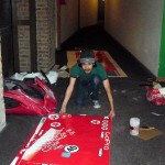
Max is pictured with the printed Adobe Illustrator vector art all ready for application to the race plastic. Yes, we made a mess, but nothing the super-dope Rainbow Vacuum Cleaner can’t handle (that product’s latest iteration was designed and developed using Pro/Engineer, which we teach, and copied by Dyson). In case you are wondering, we do work in trade sometimes.

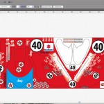 Notice the white bleed out to red and the round number plates. We wanted to showcase the new logo coming out of the white portion, something one can’t easily do with paint. The finished product has white on top and bottom and red in the middle sections; we thought the round number plate would stand out this way.
Typically a printer will want an Adobe Illustrator file PDF complete with layers. One layer for the color graphics and another layer for a magenta die cut line.
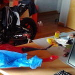
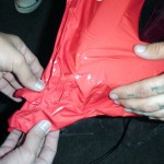 One challenge with vinyl graphics is simply applying the vinyl without the vinyl sticking to itself. Another challenge is getting the air pockets out properly. Yet another challenge is understanding what flat pattern to utilize from compound surfaces found on motorcycle race plastic, not to mention applying those graphics to the farings. We used a hot glue gun to help the vinyl stick on the b-side of the faring surfaces. Nothing a heat gun can’t untangle. This section of the upper faring defiantly does not lend well for wrapping. This is where the frame sliders would go if we used them, but we don’t use them.
If you are interested in one of the Design-Engine Adobe Illustrator workshops, consider taking our one or two week Adobe Illustrator Intensive to learn the basics of Illustrator, develop graphics for your project, then learn how to apply your printed vinyl graphics. We intend for the class to occur in the Fall of 2012 and it will probably utilize several instructors. The curriculum has not been set, but do send in your inquiry so we can use your input to plan the course dates and structure at Design-Engine|Education Adobe.
Whats next for Design-Engine? As we continue to perfect our vinyl graphics skills, we have already started the process of wrapping our Yamaha Zuma scooters, which are available for employees and out of town students to enjoy. If you see us around town, say hello, stop on in, take a class. As our sales guys says, “We’re here to help”.
